/ The Challenge
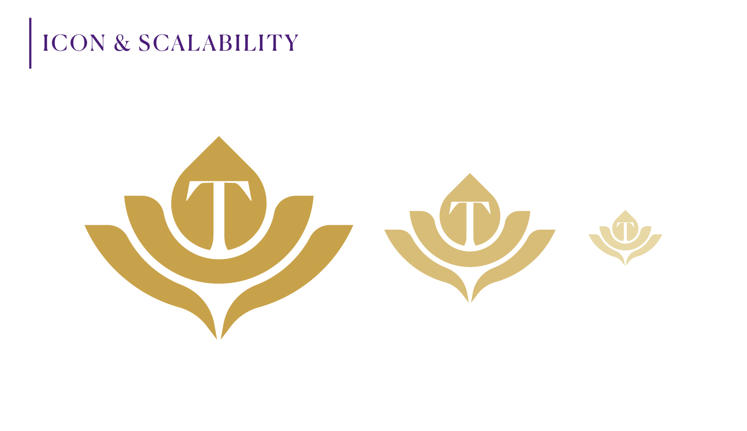
The biggest challenge was balancing elegance with simplicity. The client wanted a logo that combined multiple symbolic elements, including a lotus flower, healing hands, and a hidden “T” monogram, while remaining clean enough for embroidery, signage, foil stamping, and other premium applications.
The final design needed to communicate trust, clinical excellence, relaxation, and exclusivity without relying on common spa clichés.
/ Design Strategy
Rather than using literal wellness imagery, the concept focuses on refined geometry and thoughtful symbolism.
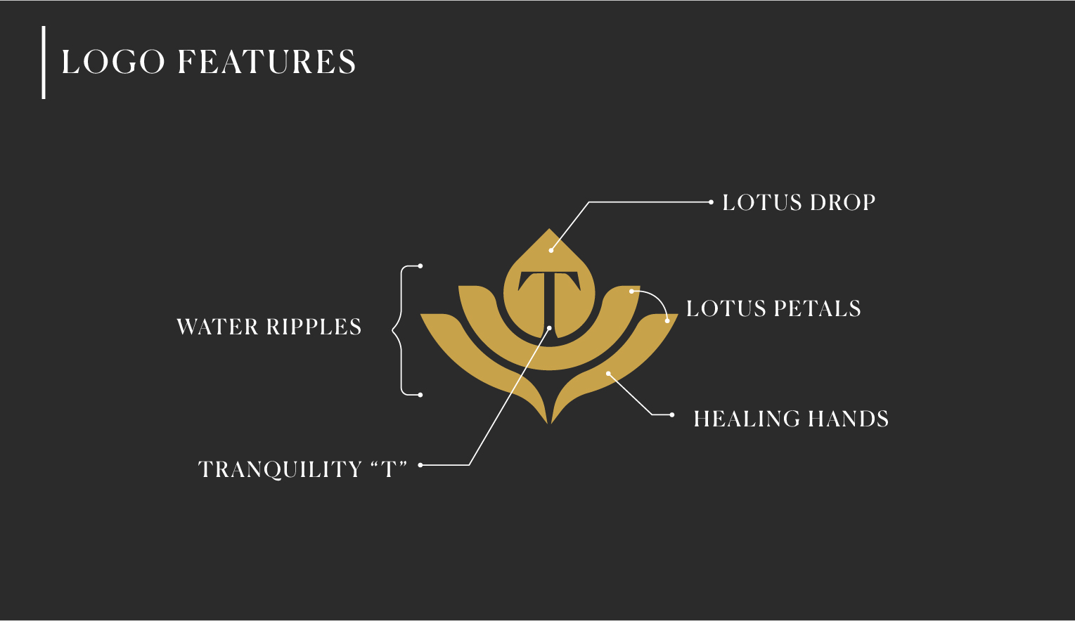
The lotus represents growth, renewal, balance, and inner peace, while the supporting hands symbolize healing, compassion, protection, and care. Hidden within the lotus petals is a subtle “T” monogram, adding a unique layer of brand recognition without distracting from the overall elegance.
Every element was carefully simplified to ensure versatility across both digital and physical applications.
/ Logo Concept
The icon combines three core ideas into one cohesive mark:
- A minimalist lotus representing wellness and transformation.
- Graceful supporting hands symbolizing therapeutic care and restoration.
- A hidden “T” monogram seamlessly integrated into the lotus petals, creating a distinctive signature unique to the brand.
The result is a timeless emblem that feels luxurious, memorable, and sophisticated while remaining highly functional across all branding materials.