Timberline Lighting

(Description)

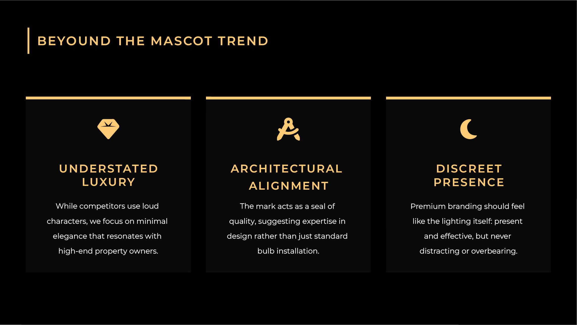
Timberline Lighting provides premium architectural and landscape illumination for high-end property owners. This identity system moves completely away from loud industry trends to establish a sophisticated, symmetrical seal of quality rooted in understated luxury.

Challenges & Objectives

/ Project Overview

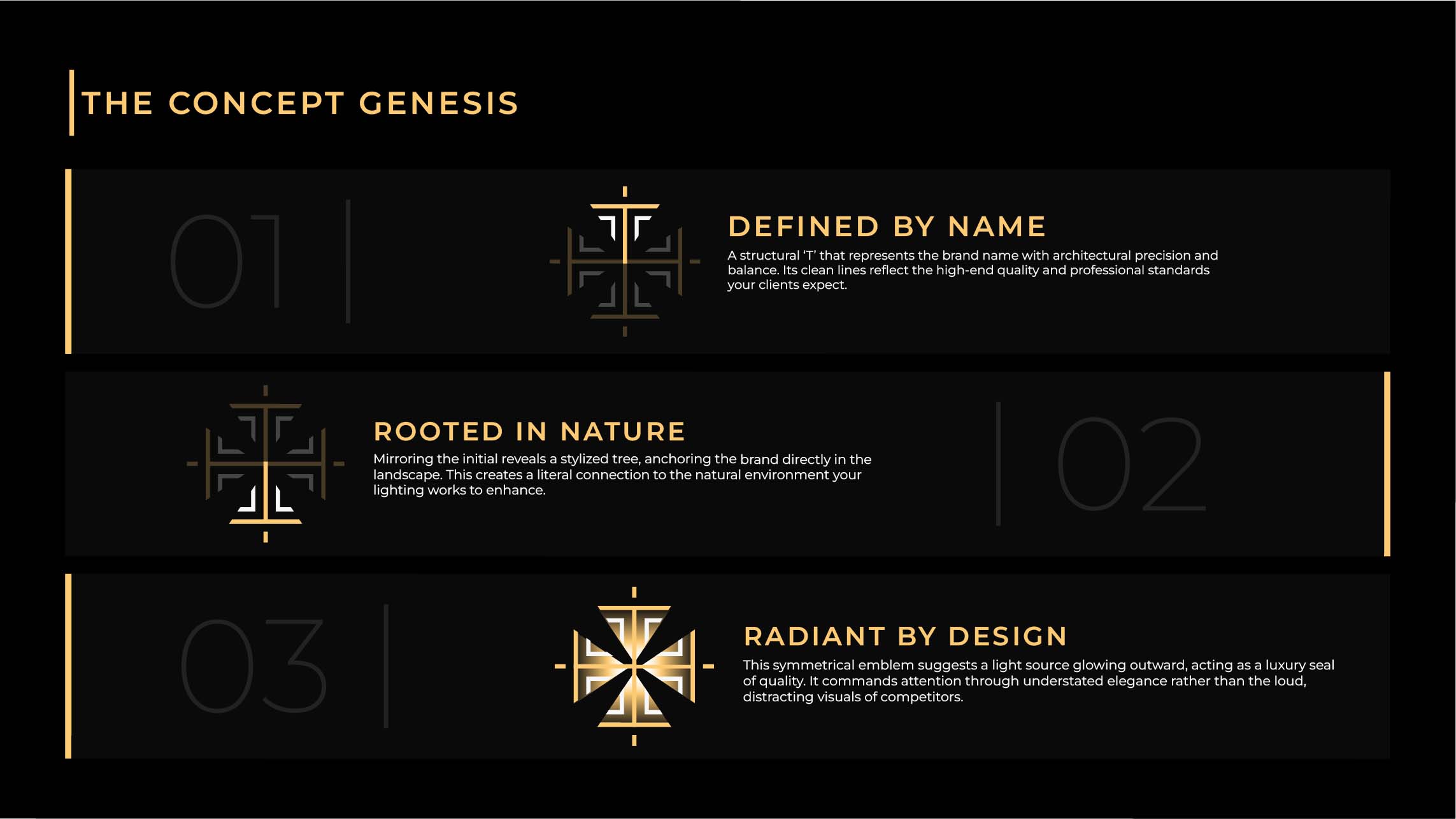
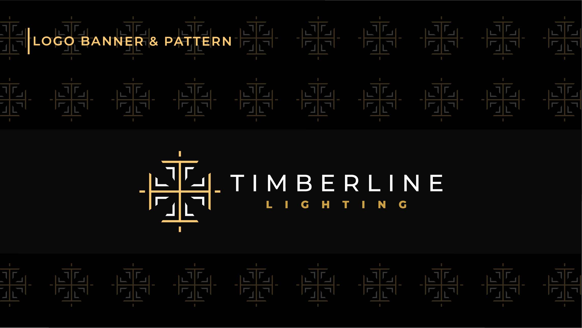
The goal was to engineer a cohesive brand identity that reflects design expertise rather than basic electrical installation. The final concept integrates three core elements: a structural letter T for architectural alignment, a stylized tree anchoring the brand to nature, and a radiant light source glowing outward.

/ Challenges

  • Avoiding the loud characters and mascot trends common among local competitors.

  • Designing an emblem that beautifully balances structural geometry with organic natural motifs.

  • Making the branding feel exactly like premium lighting itself: highly effective but never distracting or overbearing.

/ Objectives

  • Build an elegant logo system centered on architectural precision and minimal form.

  • Establish an authoritative visual asset that commands attention through quiet luxury.

  • Attract high-net-worth estate owners by presenting the brand as a premium design partner.

Final Outcome

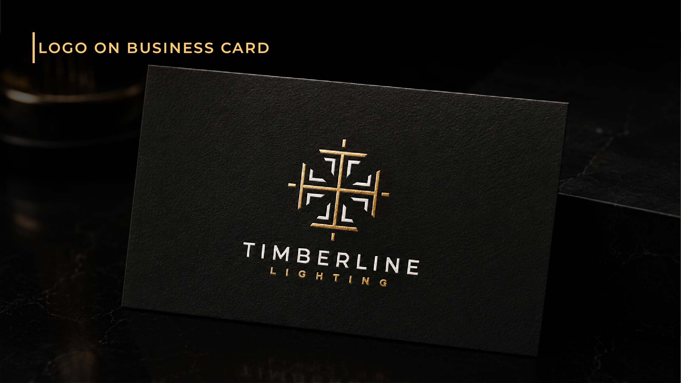
The branding project delivered a powerful, discreet identity that seamlessly aligns with luxury properties. Through a clean symmetrical emblem and sophisticated typography, Timberline Lighting is now successfully positioned as an elite expert in high-end architectural illumination.